もくじ
レスポンシブ対応するベースソース
以下のHTMLとCSSがベースになります。 紹介するデザインは、このベースを入れたうえで追加してください。ベースDEMO
HTML
<div class="tab-wrap">
    <input id="tab01" type="radio" name="tab" class="tab-switch" checked="checked"><label class="tab-label" for="tab01">タブ ①</label>
    <div class="tab-content">
        コンテンツ 1
    </div>
    <input id="tab02" type="radio" name="tab" class="tab-switch"><label class="tab-label" for="tab02">タブ ②</label>
    <div class="tab-content">
        コンテンツ 2
    </div>
    <input id="tab03" type="radio" name="tab" class="tab-switch"><label class="tab-label" for="tab03">タブ ③</label>
    <div class="tab-content">
        コンテンツ 3
    </div>

</div>
css
.tab-wrap {
  display: flex;
  flex-wrap: wrap;
  margin:20px 0;
}
.tab-wrap:after {
  content: '';
  width: 100%;
  height: 3px;
  background: #325A8C;
  display: block;
  order: -1;
}
.tab-label {
  color: White;
  background: LightGray;
  font-weight: bold;
  white-space: nowrap;
  text-align: center;
  padding: 10px .5em;
  order: -1;
  position: relative;
  z-index: 1;
  cursor: pointer;
  border-radius: 5px 5px 0 0;
  flex: 1;
}
.tab-label:not(:last-of-type) {
  margin-right: 5px;
}
.tab-content {
  width: 100%;
  height: 0;
  overflow: hidden;
  opacity: 0;
}
.tab-switch:checked+.tab-label {
  background: #325A8C;
}
.tab-switch:checked+.tab-label+.tab-content {
  height: auto;
  overflow: auto;
  padding: 15px;
  opacity: 1;
  transition: .5s opacity;
  box-shadow: 0 0 3px rgba(0, 0, 0, 0.3);
}
.tab-switch {
  display: none;
}
情報が見やすいタブデザイン
基本のHTMLに以下のcssを追加するだけでOKです。 切り替えボタンを繋げてみた感じです。 両サイドの丸角指定するため、labelにidを追加しています。 また、コンテンツ部分はセンター寄せにしていますが、お好みで外してください。情報が見やすいタブのDEMO
情報が見やすいタブCSS
ベースのcssを入れてから追加してくださいね。
.tab-label {
    margin-bottom: 1rem;
    border-radius: 0;
}
.tab-label:not(:last-of-type) {
    margin-right: 0;
}
.tab-label {
    background: #fff;
    color: #325a8c;
    border: 2px solid;
    border-left: 0;
}
label#tab04 {
    border-left: 2px solid #325a8c;
    border-radius: 15px 0 0 15px;
}
label#tab06 {
    border-radius: 0 15px 15px 0;
}
.tab-switch:checked+.tab-label+.tab-content {
    text-align: center;
}
.tab-switch:checked+.tab-label {
    background: #325a8c;
    color: #fff;
    border-color: #325a8c;
}
吹き出し付きのタブデザイン
こちらも同様に基本のHTMLに以下のcssを追加するだけでOK。 afterで付け足しているだけです。少しポップな印象になりました。吹き出し付きのタブDEMO
吹き出し付きのCSS
.tab-switch:checked+.tab-label:after {
    top: 100%;
    left: 50%;
    border: solid transparent;
    content: " ";
    height: 0;
    width: 0;
    position: absolute;
    pointer-events: none;
    border-color: rgba(136, 183, 213, 0);
    border-top-color: #325a8c;
    border-width: 14px;
    margin-left: -14px;
}
.tab-switch:checked+.tab-label {
    background: #325A8C;
    position: relative;
}
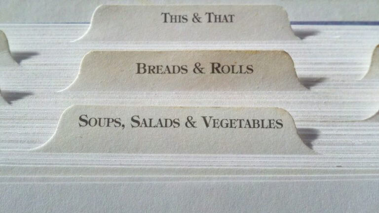
にゅるっと出てくるドッグイヤー風タブデザイン
こちらも同様に基本のHTMLに以下のcssを追加するだけでOK。 ちょっとだけアニメーションを入れてみたバージョン。 にゅるっとさせていますが、もっと早い動きを入れたいときはtransitionの秒数(.数字s)を調整してください。DEMO
にゅるっと出てくるドッグイヤー風CSS
.tab-switch:checked+.tab-label {
    background: #325A8C;
    margin-top: -0.5rem;
    transition: margin .3s;
    align-items: center;
    display: flex;
    justify-content: center;
}
.tab-label{
    border-radius: 0;
    position: relative;
}
.tab-label:after {
    position: absolute;
    top: 0;
    right: 0;
    content: '';
    width: 0;
    border-width: 0 16px 16px 0;
    border-style: solid;
    border-color: #fff #fff #ddd #ddd;
    box-shadow: -1px 1px 2px rgba(0, 0, 0, .1);
}
注意点
コピペでうまく動かないときにここをチェック!- ワードプレスの仕様で、勝手に<p>が入っていないか
※入っている場合は、ここをチェック - このサイトみたいに複数チェックボックスを使っていないか
※使っている場合は、nameとforで指定している名称を変更してみてください。 - 同じidやクラス名が別で使用されていないか