アニメーションで動かす
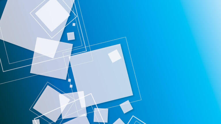
メインビジュアルに入れたら印象ガッツリ残りそう。
やりたすぎるので、そのままお借りしてきました。
四角がふわふわするDEMO
引用:https://webdesignfacts.net/entry/css-background-animation/
単純に背景に入れてもいいかもしれない。動画を入れるよりは軽いかもしれないけど、若干重くなるので注意しなくてはいけない。
四角じゃなくて、丸にするだけで、水槽の中にいるような感じにもなりますね。
そしたら回す必要なくなっちゃうか。
四角がふわふわするHTML
<div class="area" >
            <ul class="circles">
                    <li></li>
                    <li></li>
                    <li></li>
                    <li></li>
                    <li></li>
                    <li></li>
                    <li></li>
                    <li></li>
                    <li></li>

           </ul>
</div>
四角がふわふわするCSS
.context {
    width: 100%;
    position: absolute;
    top:50vh;
}
.context h1{
    text-align: center;
    color: #fff;
    font-size: 50px;
}
.area{
    background: #4e54c8;
    background: -webkit-linear-gradient(to left, #8f94fb, #4e54c8);
    width: 100%;
    height:20rem;
    position: relative;
}
.circles{
    position: absolute;
    top: 0;
    left: 0;
    width: 100%;
    height: 100%;
    overflow: hidden;
}
.circles li{
    position: absolute;
    display: block;
    list-style: none;
    width: 20px;
    height: 20px;
    background: rgba(255, 255, 255, 0.2);
    animation: animate 25s linear infinite;
    bottom: -150px;
}
.circles li:nth-child(1){
    left: 25%;
    width: 80px;
    height: 80px;
    animation-delay: 0s;
}
.circles li:nth-child(2){
    left: 10%;
    width: 20px;
    height: 20px;
    animation-delay: 2s;
    animation-duration: 12s;
}
.circles li:nth-child(3){
    left: 70%;
    width: 20px;
    height: 20px;
    animation-delay: 4s;
}
.circles li:nth-child(4){
    left: 40%;
    width: 60px;
    height: 60px;
    animation-delay: 0s;
    animation-duration: 18s;
}
.circles li:nth-child(5){
    left: 65%;
    width: 20px;
    height: 20px;
    animation-delay: 0s;
}
.circles li:nth-child(6){
    left: 75%;
    width: 110px;
    height: 110px;
    animation-delay: 3s;
}
.circles li:nth-child(7){
    left: 35%;
    width: 150px;
    height: 150px;
    animation-delay: 7s;
}
.circles li:nth-child(8){
    left: 50%;
    width: 25px;
    height: 25px;
    animation-delay: 15s;
    animation-duration: 45s;
}
.circles li:nth-child(9){
    left: 20%;
    width: 15px;
    height: 15px;
    animation-delay: 2s;
    animation-duration: 35s;
}
.circles li:nth-child(10){
    left: 85%;
    width: 150px;
    height: 150px;
    animation-delay: 0s;
    animation-duration: 11s;
}
@keyframes animate {
    0%{
        transform: translateY(0) rotate(0deg);
        opacity: 1;
        border-radius: 0;
    }
    100%{
        transform: translateY(-1000px) rotate(720deg);
        opacity: 0;
        border-radius: 50%;
    }
}
【番外編】おっさんずラブっぽい装飾にしてみた
雰囲気だけは感じてもらえると思うw
四角じゃなくて、ハートにしてみたバージョン。大きさは一つ一つ調整するのが手間過ぎて断念。